Alphaday
Description
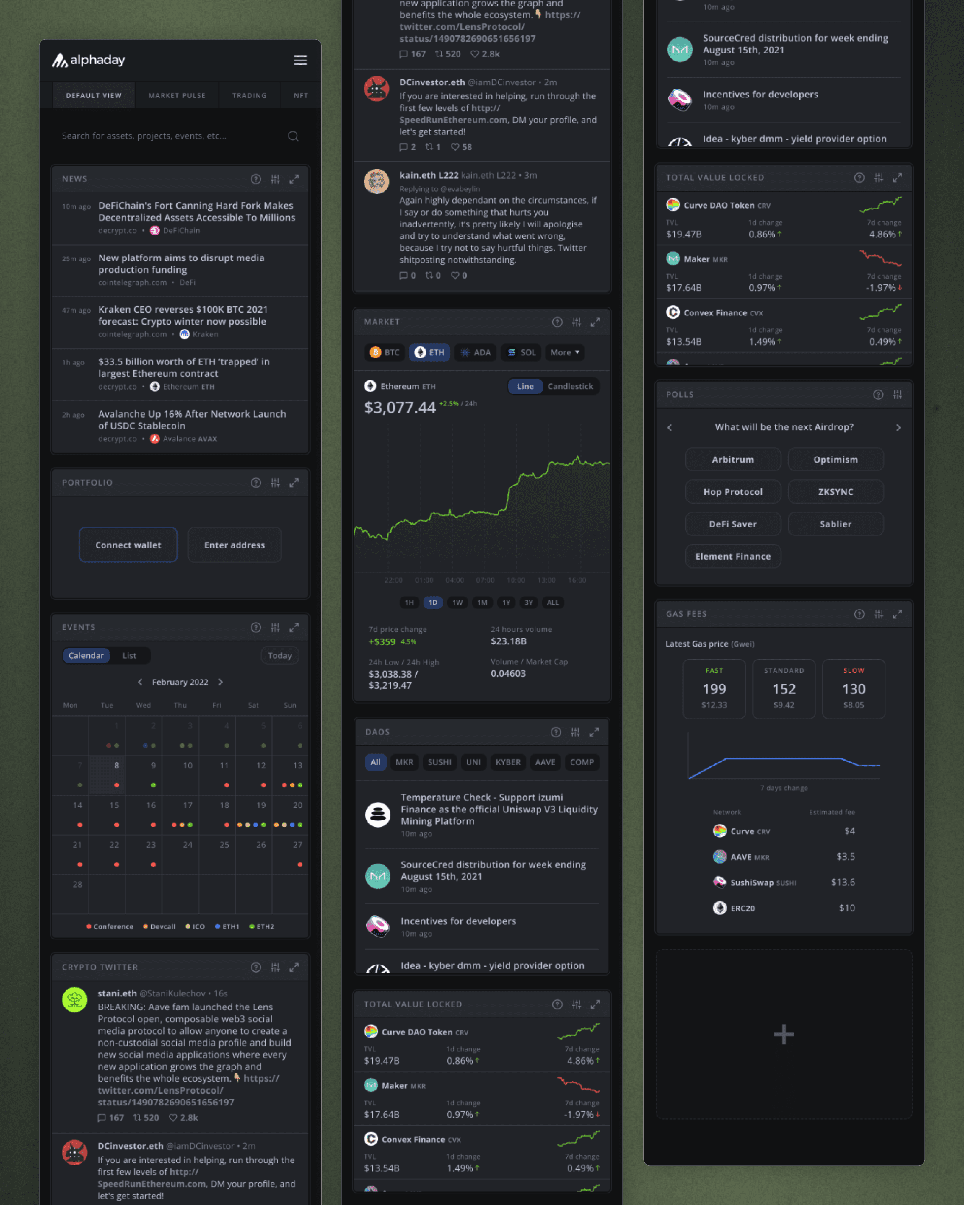
Alphaday is a modular crypto dashboard that surfaces everything from token prices and DeFi positions to news, events, and on-chain signals — all in one daily feed. The desktop experience was powerful, but overwhelming on smaller screens. My task was to translate this dense interface into a mobile-first design, preserving data hierarchy, optimizing scroll ergonomics, and ensuring a cohesive visual system. Beyond redesigning layouts, I also prototyped key interactions to help the team visualize the mobile experience end-to-end.
Client
Project
Live Website

Dashboard page
Context & UX Objectives
The Challenge
Crypto dashboards often prioritize density over clarity. Alphaday was no different — its desktop UI was filled with tabs, widgets, and nested tables. The goal for mobile was simple but non-trivial: preserve the power, reduce the overload.
Key Objectives
Re-architect the mobile layout to reduce visual fatigue
Translate tabular data into touch-native UI components
Preserve branding and visual consistency
Prototype interactions for stakeholder walkthroughs
Deliverables
Dashboard redesign
Mobile navigation and tab restructuring
Modular component optimization
Clickable Figma prototype for internal demoing
Design Process & Solutions
My approach focused on modularity, readability, and progressive disclosure — revealing the right amount of information, at the right time.
Layout Rethink
Designed a vertical-first dashboard with collapsible and scrollable modules
Used card-based grouping to segment content clearly
Reduced decision fatigue by prioritizing actionable insights at the top
UX Systems
Restructured navigation with bottom tabs and overflow menu
Introduced expandable sections for dense data (like token analytics)
Ensured touch targets and content blocks followed mobile heuristics
Visual & Brand Fidelity
Retained Alphaday’s dark theme and branding
Balanced visual noise with micro-typography adjustments
Ensured a pixel-perfect match between desktop tone and mobile hierarchy

Results & Reflection
What Shipped
A complete mobile Figma prototype handed off for dev scoping
Redesigned dashboard, analytics, and profile screens
Clean transition system between daily summaries and deeper insights
What Worked
Modularity allowed for flexible scaling across user preferences
Scroll ergonomics and groupings improved content legibility
UX feedback loop was tight — internal reviewers could interact, not imagine
What I Learned
Designing dashboards for mobile isn’t about removing data — it’s about orchestrating the reveal
Crypto UI design is about calibrating confidence: when to simplify, when to show the details
Good mobile dashboards teach users what matters before they ask
Curious to See the Real Work?
See how I actually design — not just the pretty screens. Book a walkthrough of my Figma files, UX flows, and strategic thinking.
"Vikrant's expertise has greatly benefited Deep Work, including Deep Teams, and client projects like Alphaday and Spark, where his UX work truly shines. His reliable, multi-skilled design work results in flawless user experiences, making him a valuable team asset."
Charlie Ellington
Creative Director, Deep Work Studio
