Spark (MakerDAO)
Description
Spark Protocol is a new lending and borrowing platform built on MakerDAO’s infrastructure. While the desktop version was already in place, my role was to adapt and optimize the experience for mobile, ensuring responsive usability, clarity of data, and UI cohesion with the brand’s established visual system. This project involved translating complex financial dashboards and DeFi actions into an intuitive mobile-first experience — making Spark feel like a native app without compromising on precision or functionality.
Client
Project
Live Website & dApp

Borrow page
Context & Goals
The Challenge
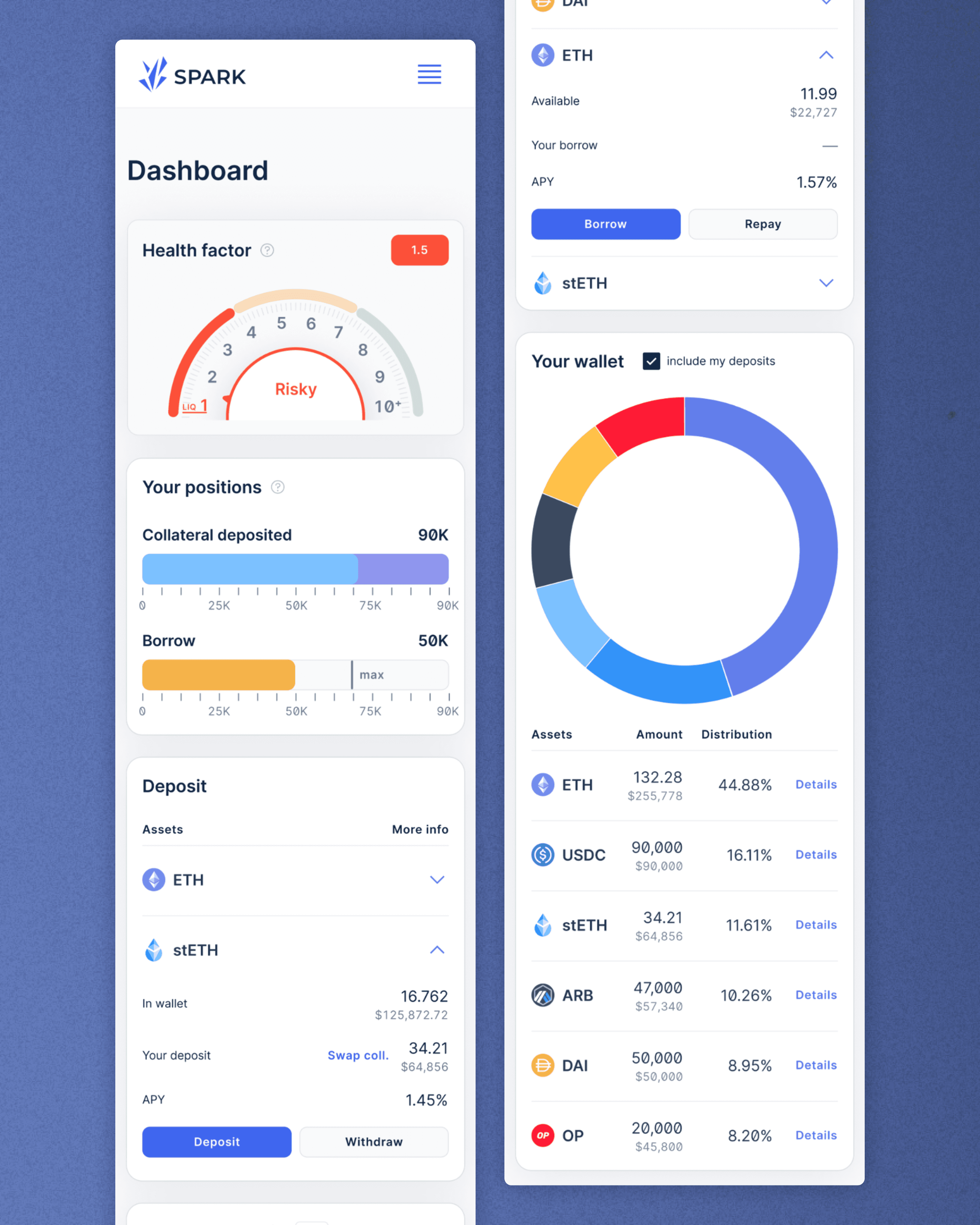
Spark’s core dashboard is built around rich data tables and nested flows — great for desktop, but overwhelming for mobile. My challenge was to retain the protocol’s functional clarity while making the experience feel touch-native and readable on smaller screens.
Core Goals
Preserve the structure and visual clarity of desktop
Prioritize legibility, actionability, and UX speed
Solve for scroll fatigue and visual hierarchy without reducing depth
Scope of Work
Translate key screens (Dashboard, Borrow flow, Wallet view) to mobile
Simplify navigation through hamburger expansion and modal transitions
Restructure data-heavy components like pie charts and position tables
Spark dApp dashboard mobile—
Design Execution
Working within an existing design system, my focus was on UX micro-decisions that create macro clarity.
Key Adaptations
Replaced tabular layouts with scrollable, collapsible modules
Used chevrons and expanded cards to layer information without clutter
Introduced step-based flows for key actions like deposit and repay
Optimized font scales and icon spacing for mobile ergonomics
Designed a hamburger menu with nested navigation for full protocol access
Visual Thinking
Maintained brand fidelity using Spark’s existing type and color guidelines
Ensured accessibility contrast for dark/light mode support
Kept core DeFi metrics (LTV, APY, risk levels) above the fold for quick scanning
Hamburger menu, Repay modal, Success modal—

Outcomes & Reflection
Impact
Helped Spark maintain visual consistency across form factors
Reduced interaction friction for on-the-go users and first-time borrowers
Delivered a clean Figma prototype that was developer-ready
Takeaways
Even the best DeFi tools need mobile-first thinking
Adapting isn’t just shrinking — it’s restructuring mental models for new devices
Micro-interactions and spacing decisions can dramatically shape user trust
Behind the scenes—

Curious to See the Real Work?
See how I actually design — not just the pretty screens. Book a walkthrough of my Figma files, UX flows, and strategic thinking.
"Vikrant is an excellent designer, who understands the principles of smooth user interaction. He keeps the working documents very clean and always contributes constructive ideas. Not to mention, his ability to grasp and learn things at speed."
Andrej Berlin
CEO, Deep Work Studio
